Context & Business Background
Target Audience Personas

Williams Joana, 33
Evaluating operational efficiency, shrinkage reduction, and clear ROI metrics.

Anderson, 38
Scouting tech partners. Needs proof of reliable computer vision and seamless integration.

Taylor, 52
Needs reassurance, simplicity, and clear understanding of how it impacts daily operations.
The Problem
The audit revealed four core sub-problems degrading the user journey:
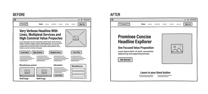
Information Density:
Overwhelming first-time visitors with long-scroll unstructured data.
Unclear Value Proposition:
Above-the-fold messaging is generic and lacks specificity.
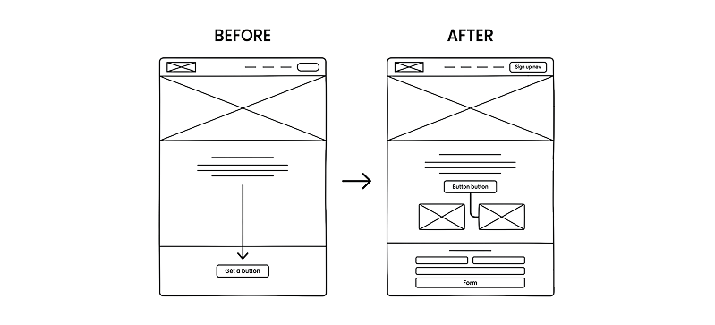
Passive Conversion Paths:
Lead capture mechanisms are undifferentiated and friction-heavy.
Buried Trust Signals:
Award and partnership validation requires 3+ scrolls to uncover.
Discovery & Research Approach
The research scope covered 7 key pages (Home, DigitKart, DigitMart, DigitKartX, DigitCooler, About, Contact) utilizing the following methodologies:
Heuristic
Evaluation:
Systematic review against Nielsen's 10 Usability Heuristics.
Cognitive
Walkthrough:
Task-based analysis simulating the Enterprise Buyer journey.
Comparative
Analysis:
Benchmarking against Standard Cognition, AiFi, Trigo, and Grabango.
Accessibility
Audit:
Baseline WCAG 2.1 AA compliance check.
Trade-offs and Decision Rationale
This project was fundamentally about balancing storytelling, credibility, and conversion in a B2B environment where trust needs to be built before action happens.
Clarity over brand abstraction
A more conceptual hero can feel polished, but it often slows understanding. I prioritized direct language that helps enterprise buyers immediately understand the offer.
Trade-off: Slightly less brand flourish, but much better first-pass comprehension.
Earlier proof over a more minimal layout
Surfacing awards, partnerships, and validation earlier can make the layout feel more information-dense. I chose that direction because delayed proof creates unnecessary doubt in B2B journeys.
Trade-off: Less visual breathing room, but faster credibility-building.
less visual breathing room, but faster credibility-building.
A single form-based CTA is easier to manage, but it does not serve all levels of buyer intent equally well. I recommended more flexible conversion paths for users at different stages of readiness.
Trade-off: A slightly more complex CTA system, but better alignment with actual user behaviour.
Structured hierarchy over equal-weight storytelling
The original experience treated too many messages as equally important. I recommended stronger prioritization so users encounter value, proof, and action in a more deliberate order.
Trade-off: Some content becomes less prominent on first pass, but the overall journey becomes easier to follow.
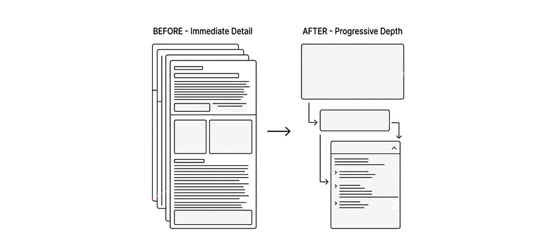
Progressive depth over immediate detail
Enterprise buyers need substance, but not all at once. I structured the experience so users can deepen into details after they understand the high-level proposition.
Trade-off: Less up-front detail density, but stronger engagement and less drop-off.
Strategic Redesign Direction
Consistency & Standards
Typography, button styles, and illustration weights.
We refined the website's design system by standardizing visual components, navigation, and interaction behaviors across the platform. This improved consistency, reduced user friction, and delivered a more seamless and trustworthy experience while supporting long-term scalability.
Brand guide
Positive Version

Negative Version

Primary Colours
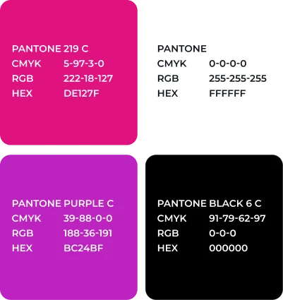
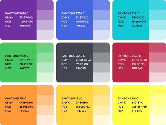
Secondary Colours
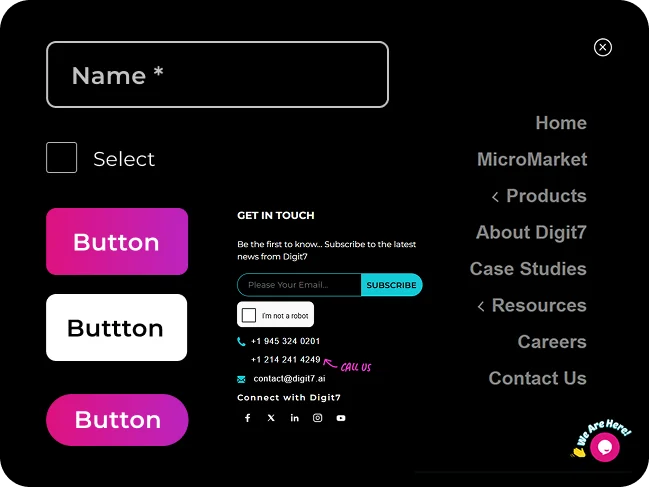
Error Prevention
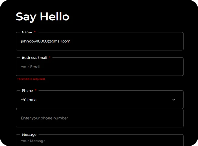
Contact forms inline validation before submission.
We optimized the contact form journey by implementing inline validation for required fields, formatting, and input errors. By providing immediate feedback throughout the process, we reduced user friction, increased form completion rates, and delivered a smoother, more intuitive experience.
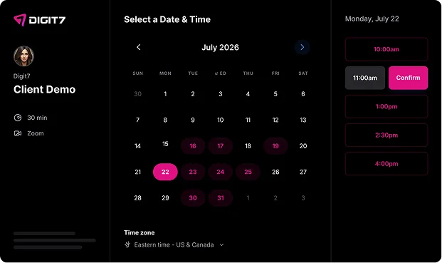
Flexibility & Efficiency
Fast-track conversion (e.g., direct calendar booking) for experts.
We optimized the conversion journey by enabling direct calendar booking with experts. This streamlined the scheduling process, reduced decision-making friction, and helped create a smoother, more efficient experience for users with strong purchase intent.
Aesthetic & Minimalist Design
Avoided visual clutter and competing elements dilute the core message.
We refined the platform’s visual structure by reducing interface clutter, improving information hierarchy, and prioritizing high-value user actions. These changes increased content clarity, strengthened messaging effectiveness, and delivered a more intuitive and conversion-focused user experience.
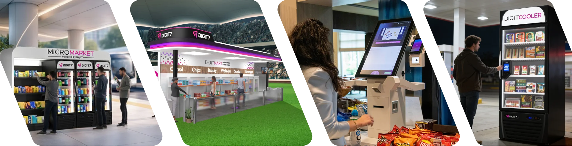
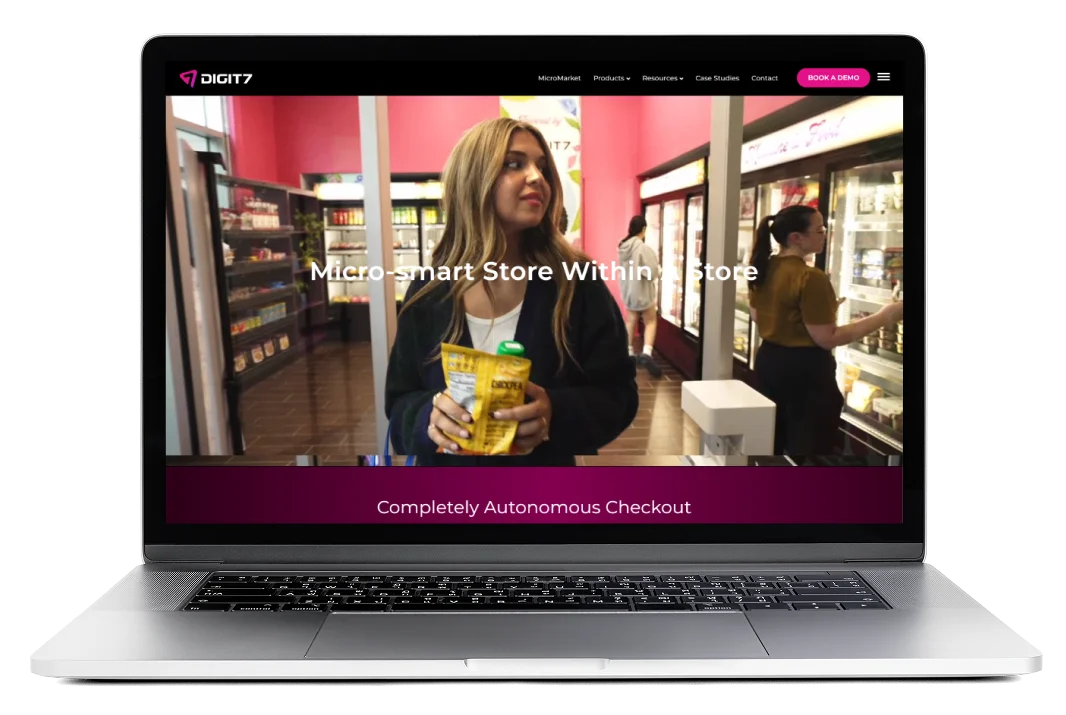
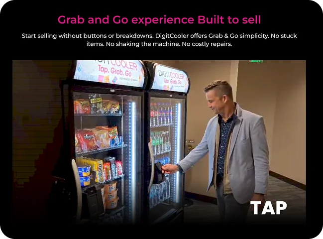
Powerful Product Demonstrations
Embedded video walkthroughs of DigitKart in action build credibility instantly by showing, not just telling.
We integrated product walkthrough videos to visually demonstrate how each solution performs in real-world environments. These enhancements improved product transparency, increased user confidence, and helped prospective customers evaluate platform value more effectively and efficiently.

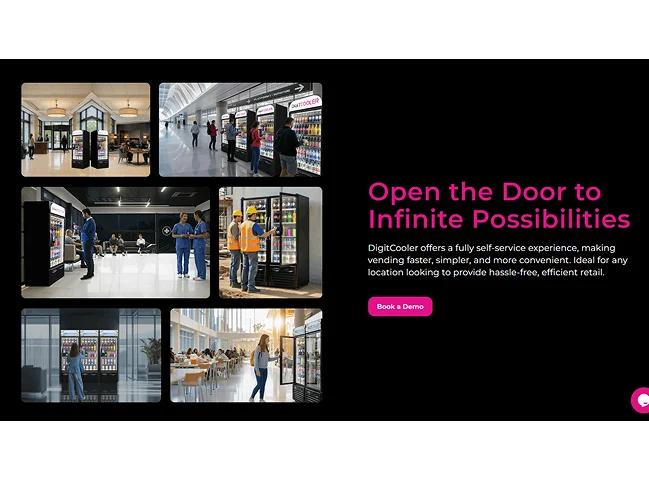
Strong Domain Storytelling
Clear articulation of retail pain points (long lines, shrinkage, inventory) creates immediate resonance with decision-makers.
We repositioned the platform narrative around critical retail challenges, including queue management, inventory accuracy, and shrinkage reduction. By connecting product capabilities to tangible operational outcomes, we improved message clarity, increased stakeholder engagement, and reinforced the solution’s business value.
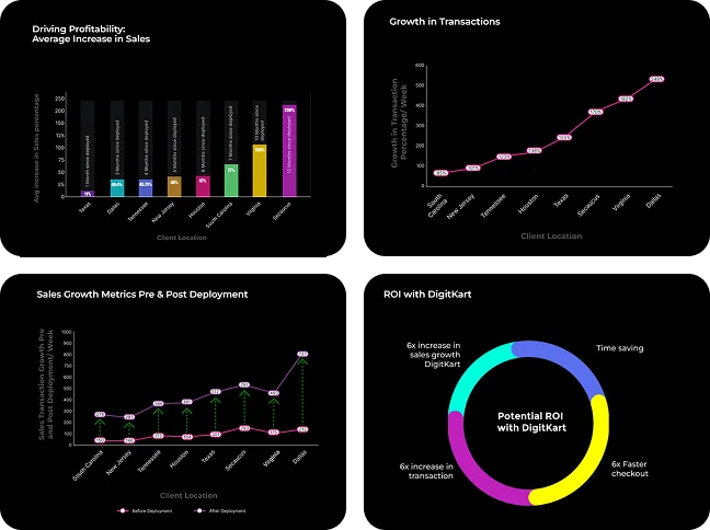
Tangible Data Visualizations
Sales growth metrics and ROI charts give B2B buyers exactly the quantitative proof they need to build a business case.
We integrated outcome-based metrics and ROI visualizations to highlight the measurable results achieved through the platform. By making business impact more visible and accessible, we strengthened buyer trust, supported internal stakeholder alignment, and improved conversion readiness among prospective customers.
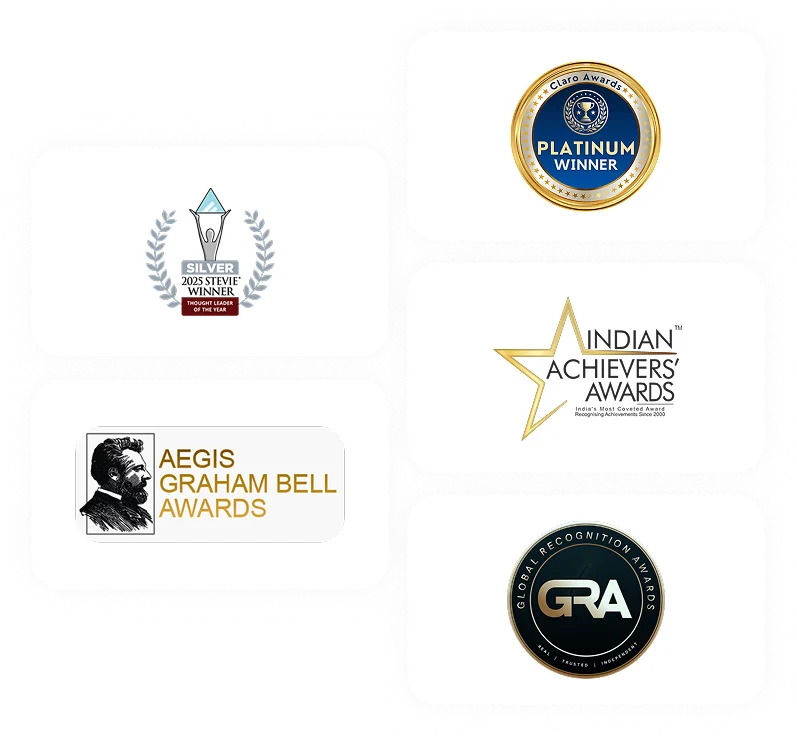
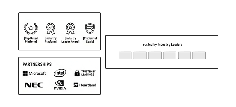
Award & Recognition Wall
The carousel of TITAN, Globee, and Texas Awards establishes immediate authority as a cutting-edge provider.
We elevated the brand experience by creating a dedicated recognition carousel highlighting prestigious awards such as TITAN, Globee, and Texas Awards. By surfacing credible third-party endorsements, we strengthened market positioning, enhanced perceived expertise, and improved trust throughout the customer evaluation journey.
Strategic Partners Logo Bar
Featuring Microsoft, Intel, NEC, and NVIDIA successfully leverages borrowed credibility.
We introduced a dedicated trust-building section featuring globally recognized brands such as Microsoft, Intel, NEC, and NVIDIA. By leveraging established industry credibility, we strengthened the company’s market position, validated its expertise, and increased trust throughout the enterprise buyer journey.
Solid SEO & Content Surface
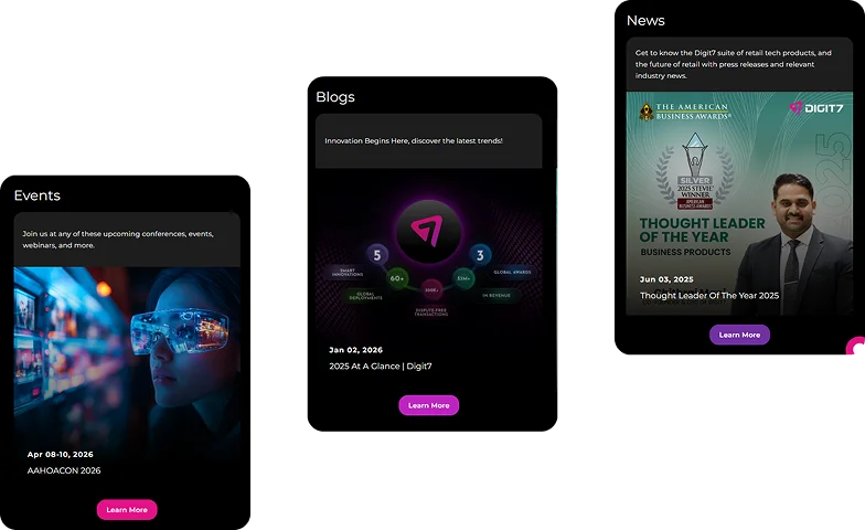
Comprehensive glossary, blog, and dedicated industry pages support organic discovery effectively.
We implemented a scalable content framework consisting of a comprehensive glossary, thought leadership content, and dedicated industry pages. This approach increased organic visibility, provided valuable educational resources for users, and established the brand as a credible and authoritative voice within the industry ecosystem.