
Simplifying
Federal
Compliance UX
Project Overview
Context & Business Background
The users of this module operate in a high-stress, federally regulated environment. They include K-12 school district nutrition teams, state child nutrition agencies, and USDA reviewers.
The stakes are deeply human: meals for millions of low-income students depend on the speed and accuracy of these eligibility decisions. A delayed or incorrectly processed application literally means a hungry student. From a business perspective, PrimeroEdge's goals were strict federal compliance, dramatically faster processing times, better Direct Certification match rates (getting students benefits automatically without paper applications), and reducing audit findings.
Target Audience Personas

Mary, 40
Owns eligibility for 30+ schools. Juggles thousands of applications, strict USDA audits, and frantic family communications.

Carlos, 48
Audits district compliance. Needs fast, remote access to unalterable evidence and historical timelines

Linda, 55
Non-technical user. Enters stacks of paper applications during enrollment week; gets stuck on federal jargon.
The Problem
The legacy Eligibility module worked — but it punished the people who depended on it most. Federally compliant ≠ humanly usable.
The core issues with the legacy system centered around cognitive friction and data entry speed:
Cognitive
overload:
Dense screens presented hundreds of fields per workflow with no progressive disclosure.
Inconsistent
patterns:
6 different modules built over a decade looked and behaved like completely different software.
Slow data
entry:
Paper-to-digital application entry was brutally slow, taking 8–10 minutes per student.
Compliance
fragility:
Status changes, audit trails, and Direct Certification re-runs were buried deep in the UI, leading to costly errors during state reviews.
Hypothesis: By unifying the interface under a strict Atomic Design system, replacing dense forms with guided wizards, and elevating status visibility, we could drastically reduce processing time while passively ensuring USDA compliance.
Discovery & Research Approach
Our research methodologies included stakeholder interviews (12 district directors, 4 state agency reviewers), contextual inquiry (shadowing a nutrition team during the chaotic enrollment week), a heuristic teardown of the legacy system, a deep-dive USDA federal policy review (forms 7CFR 245), competitive analysis (Heartland, Meals Plus, Titan), and an accessibility baseline audit.
Design Strategy & Principles
Clarity over
Density
Reveal complexity progressively. Don't show federal documentation fields until the exact moment they are needed.
Status as a First-
Class Citizen
Every record across the entire platform carries a clear, color-coded state that is universally understood.
One Action
Per Step
Replace intimidating mega-forms with guided wizards. Let users focus on one logical chunk of data at a time.
Compliance
Without Friction
Audit trails, timelines, and timestamps happen invisibly in the background, rendering the district audit-ready by default.
We didn't design screens. We designed confidence — for parents waiting on a meal decision, for directors closing the books, for auditors signing off in seconds.
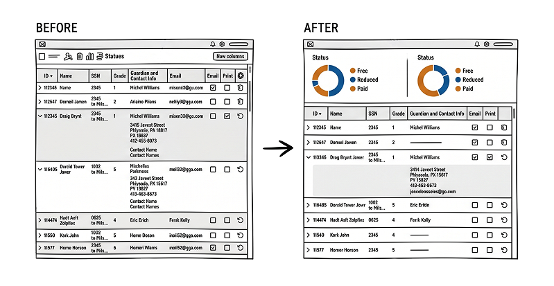
Applications list — designed around the daily ritual: scan, filter, act. Status colors became the team's shared vocabulary.
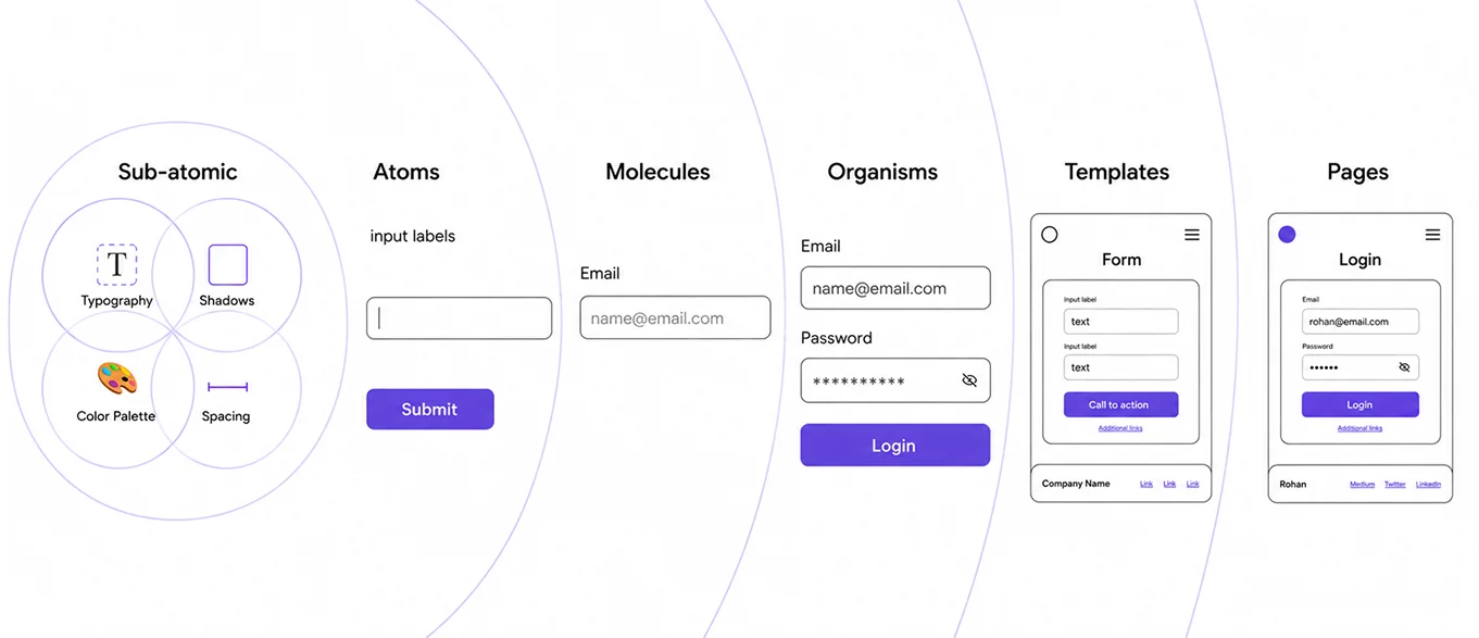
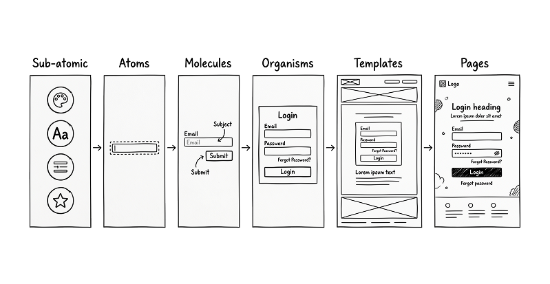
The Atomic Design System
Hypothesis: By unifying the interface under a strict Atomic Design system, replacing dense forms with guided wizards, and elevating status visibility, we could drastically reduce processing time while passively ensuring USDA compliance.
Atomic Design served as our strategic backbone. Before we could design complex workflows, we had to standardize the foundational elements. Once the Atoms (buttons, inputs, icons, avatars) and Molecules (profile molecule, status pill, filter row) were locked and codified, our Organisms (application card, eligibility summary chart, student row) composed predictably and beautifully.
The Eligibility module was the first to fully ship on this new system. Because we established strict rules at the atomic level, the subsequent redesigns of the remaining five EDGE 2.0 modules followed rapidly and cohesively.
Trade-offs and Decision Rationale
This project required balancing regulatory complexity with real human working conditions. The goal was not to hide complexity entirely, but to sequence it in a way that users could manage.
Guided workflows over compressed forms
A single-page form can appear faster, especially for experienced users, but in this context it increased fatigue, omissions, and uncertainty. I chose a wizard-based approach because clarity and accuracy mattered more than compressing everything into one screen.
Trade-off: more steps in the flow, but much better usability and confidence.
Progressive disclosure over full visibility upfront
Showing everything at once can create a sense of completeness, but it made the legacy experience hard to process. I revealed complexity in stages so users could focus without losing access to required detail.
Trade-off: less all-at-once visibility, but significantly lower cognitive load.
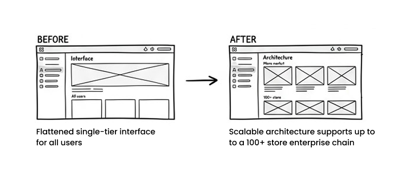
System consistency over isolated optimization
It would have been possible to solve only the Eligibility module at a local level. Instead, I used Atomic Design to create reusable patterns that could support the rest of the suite.
Trade-off: more upfront design-system effort, but stronger scalability and faster future modernization.
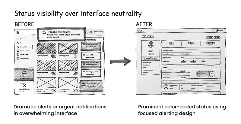
Status visibility over interface neutrality
The redesigned product uses stronger state cues than the legacy version. This added more visual structure, but it made records easier to interpret and reduced confusion during handoffs and audits.
Trade-off: a more assertive interface, but far better operational clarity.
Audit-readiness built into the workflow over manual traceability later
Rather than making users reconstruct history after the fact, I designed the system so state changes, timelines, and supporting records were surfaced naturally through the workflow.
Trade-off: more emphasis on workflow history and system behavior, but less downstream audit friction.
Key Workflows Designed
Design
Language
Unified UI across 6 legacy modules.
70% Reusable
Components
Drastically reduced design debt and inconsistencies.
40% Faster
Delivery
Engineering velocity increased due to strict component libraries.
Baked-in
Accessibility
Contrast and focus states solved once at the atom layer.
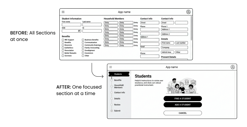
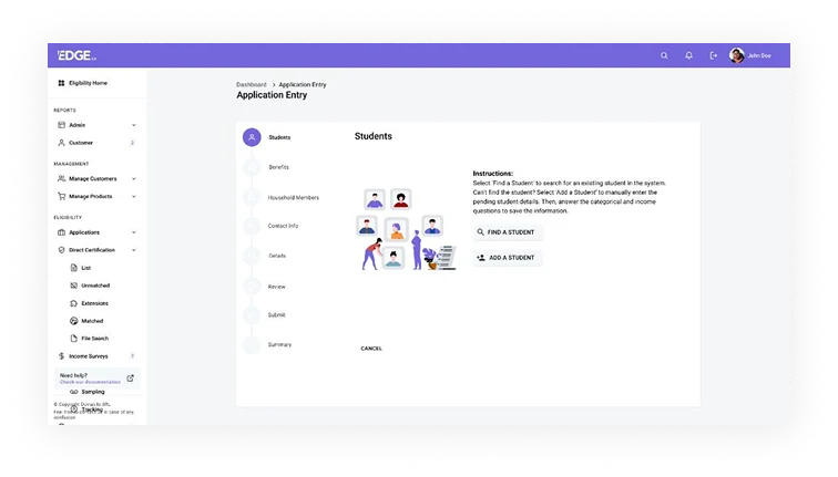
Application Entry
The legacy data-entry flow asked users to work through a long and cognitively demanding form. I redesigned this as a guided workflow that breaks the process into smaller, more understandable steps.
This reduced the pressure of working through everything at once and helped users focus on the current decision without losing sight of the overall flow. It also better supported the realities of paper-to-digital processing in district environments.
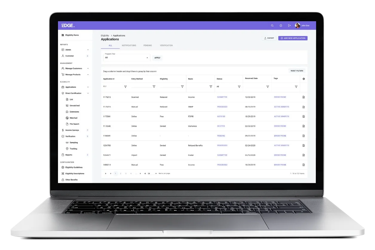
The Applications Workspace
The applications list was redesigned as a working surface for daily triage rather than just a storage table.
Tabs, filters, program-year controls, status visibility, and tagging behavior were all structured to help teams sort work faster, identify what needed attention, and act with less ambiguity. The goal was to make the list reflect the real rhythm of operational review.
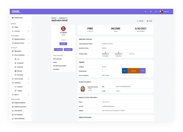
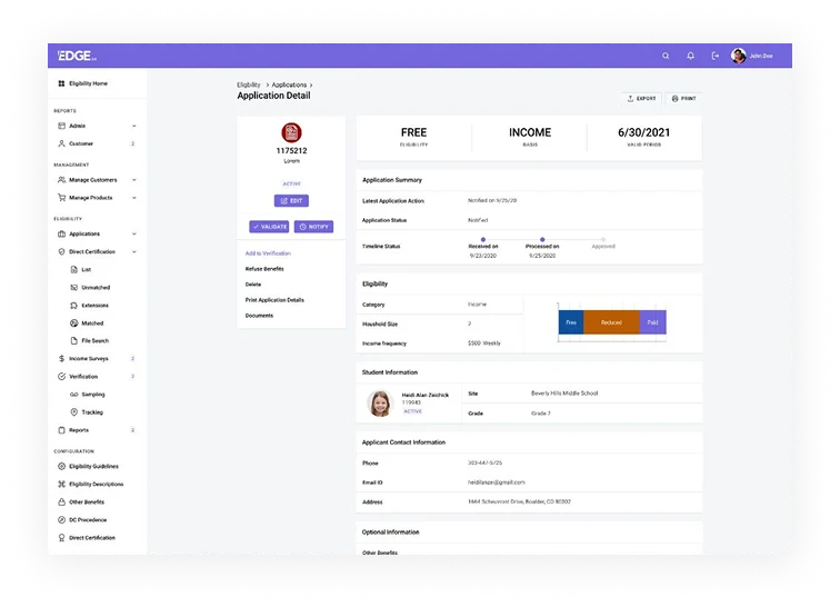
Application Detail
The detail view was designed as a single source of truth for decision status, supporting context, and record history. Rather than burying the core outcome, I brought the most important decision information to the top and used the rest of the page to provide evidence, lifecycle context, and additional detail in a more digestible way.
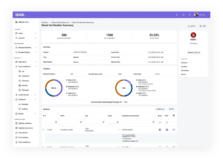
Direct Certification Summary
Direct Certification workflows involve complex policy and matching logic, but users still need to understand performance in practical terms. I designed this area to help teams interpret match activity, understand impact, and move through supporting records without getting lost in the mechanics of the system.
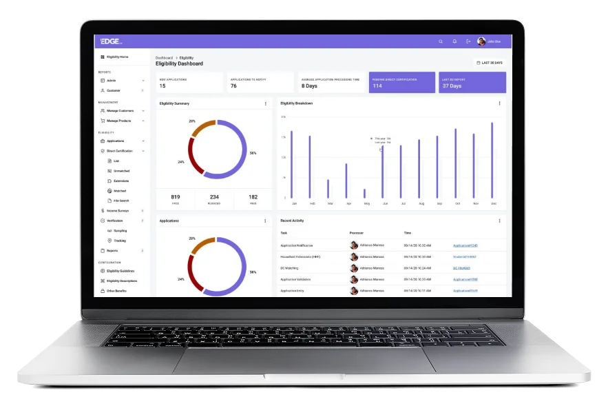
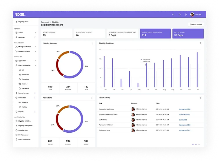
The Eligibility Dashboard
The dashboard was structured to answer the operational question users start with each day: where do we stand right now?
High-level metrics, summaries, trend views, and recent activity were organized to help teams understand workload, progress, and current attention points without having to navigate across multiple screens first.
UX Decisions That Mattered
Color-Coded Status Pills
Created a shared visual vocabulary across the team, reducing verbal miscommunications about application states.
The Wizard Pattern
Replacing the mega-form eliminated "partial save anxiety" and prevented fatal omissions in high-stakes data entry.
Persistent Help Footer
A sticky "Need Help? Check our documentation" anchor because compliance officers constantly reference federal USDA rules.
Triage Tagging
A dedicated tag column ("Error Prone", "Active Benefits") allowed for instant visual sorting on the massive Applications list.
Before/After Donut
Translated dense Direct Certification matching into a clear, board-ready story about increased federal funding.
Unified Module Switcher
Visual continuity in navigating between Eligibility, Production, and Inventory drastically reduced cross-training time.
Accessibility & Inclusion
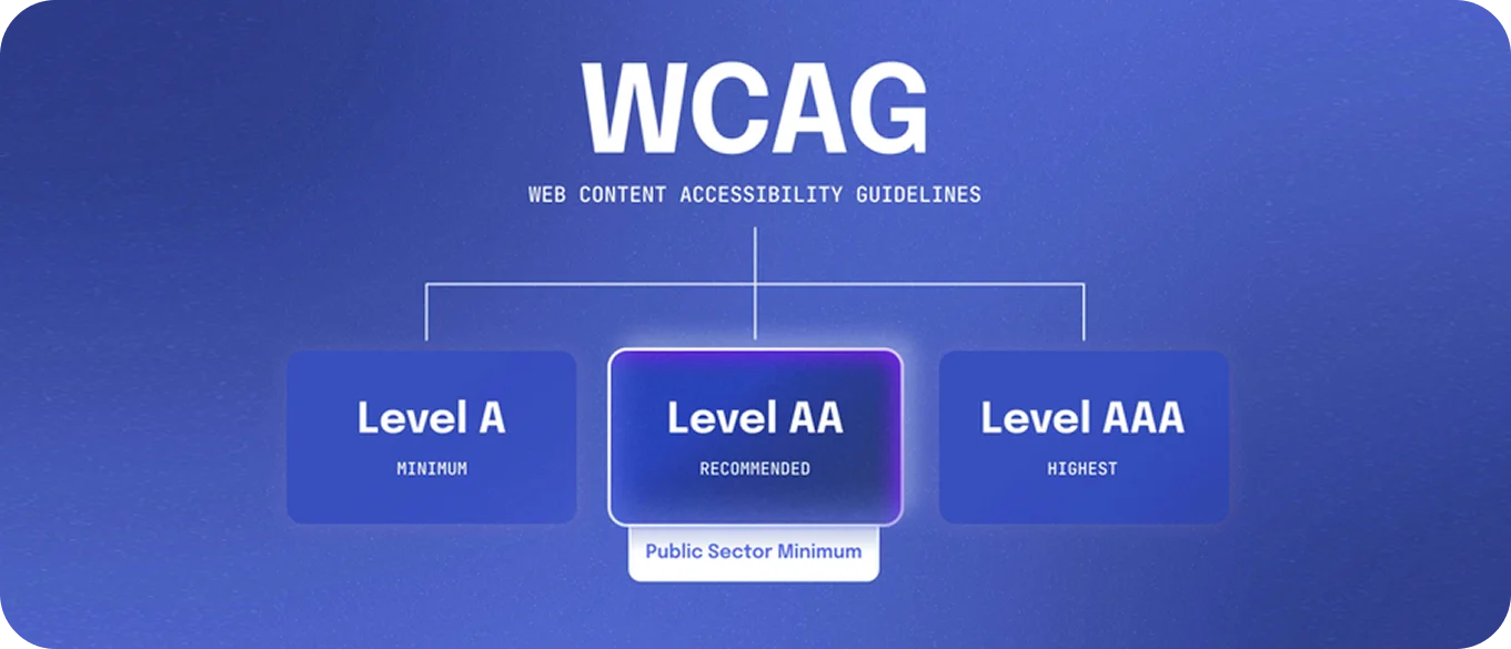
Achieving WCAG 2.1 AA was a non-negotiable requirement. We enforced a strict 4.5:1 contrast ratio on all body text and built comprehensive keyboard-only flows for rapid application entry. Focus rings were designed and hardcoded into the atom layer so they couldn't be accidentally overridden by developers. Screen reader labels were meticulously applied to all status pills and charts.
Why it matters: The user paying the bill is a school district—but the people whose lives depend on this software are children and parents who often don't speak English as a first language. Ensuring language customization for parent-facing applications and guaranteeing screen reader compatibility wasn't just a technical checkbox; it was an ethical imperative.
Impact (Outcomes & Engagement)
Entry Time
Reviews
Rate
6 Modules
(Pilots)
The engagement story mapped perfectly to our funnel logic: better dashboard awareness led to faster triage on the Applications list. This cleaner, more organized Application Detail page drove higher confidence during Direct Certification re-runs, ultimately culminating in cleaner, zero-finding state audits.
Post-launch analytics and user feedback were overwhelming. Nutrition directors were logging in earlier and spending less overall time in the system. Support tickets related to federal compliance jargon plummeted.
Most importantly, state agency reviewers noted that the clarity of the timeline and audit trails allowed them to significantly reduce their on-site audit days. On the household side, parent-facing application abandonment fell drastically thanks to the clear wizard approach and multilingual support.
Reflection
This project cemented a core belief: GovTech UX is real UX, and perhaps the most consequential UX we can work on. Federal regulation is frequently viewed as an obstacle to good design, but treating it as a hard constraint actually produces incredible clarity if you let it.
The Atomic Design system was the true multiplier here. By solving the complex interaction problems at the molecular level, we didn't just fix the Eligibility module—we laid the scalable foundation that modernized PrimeroEdge's entire multi-million dollar software suite.